Slider widget in Niche Addon plugin is to add banner slider in the hero section. You can use this layout of the widget based on your needs. From the below steps, you will see how to work with Slider Widget.
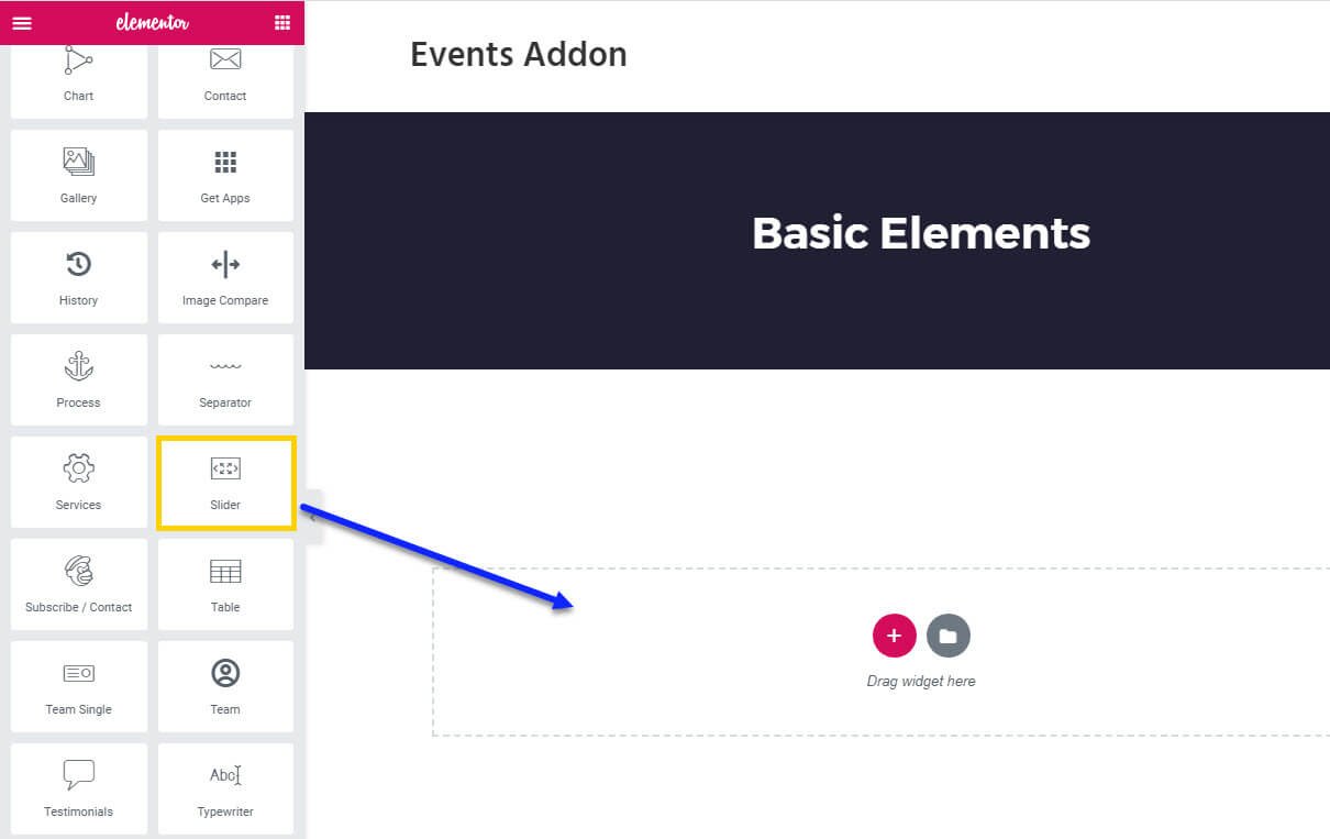
Step O1 :
In the basic Niche Addon Widget you can see Slider Widgets in the Elementor Sidebar Widget. Simply drag and drop it to the highlighted area.
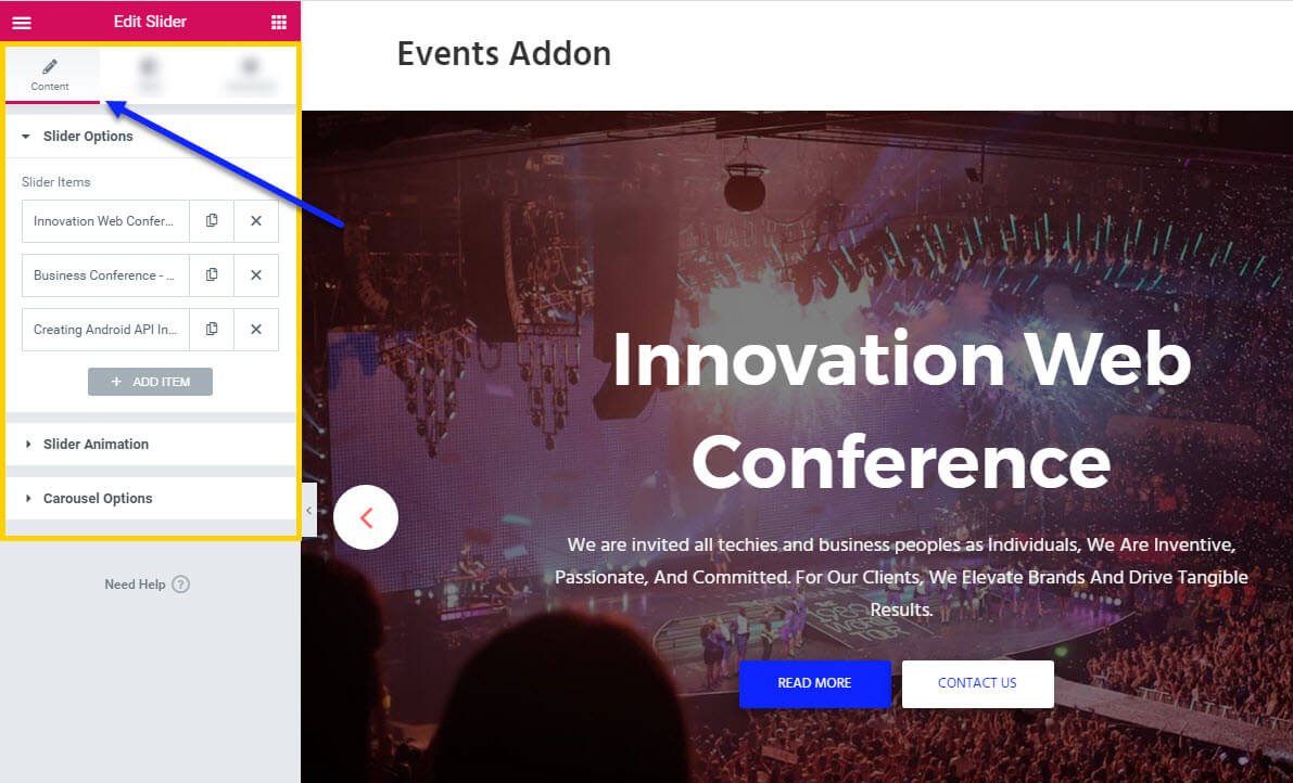
Step O2 :
After adding Slider widget in that content area you can simply fill the fields in the Content Tab.
The content tab consists of content area for the shortcode.
- Slider Options : in this section you have Slider Items options to add slider contents like Alignment, Slider Background Image, Slider Title, Slider Content, Button One, Button Two options.
- Slider Animations: in this section you can add entrance animations for each sliders like Title Entrance Animation, Content Entrance Animation, Button Entrance Animation, Image Entrance Animation
- Carousel Options: You can control all carousel options here like Disable Loop, Dots, Navigation, Auto Play, Auto Play Timeout, Pagination Dots Clickable, Auto Play Speed, Slider Effect, Disable Mouse Drag.
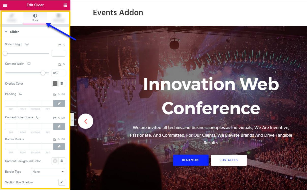
Step O3 :
In this step you’ll see what are the options available in Style Tab.
The style tab consists of options for changing the style of the shortcode.
- Slider : In this you can control the Slider Height, Content Width, Overlay Color, Padding, Content Outer Space, Border Radius, Background Color, Border Type, Section Box Shadow of the Slider Widget
- Navigation : Here you can control the Size, Arrow Color, Background Color, Border Type for normal and hover state of the slider section.
- Dots : Here you can control the Size, Margin, Background Color, Border Type for normal and hover state of the slider section.
- Title : Here you can control the Title Padding, Typography, Color, Highlight Title Color of the title.
- Content : In this section you can control the Content Padding, Typography, Color of the content section.
- Button One : In this button option you have options for changing Border Radius, Width, Padding, Typography, Color, Background Color, Border, Hover Color, Hover Background Color, Hover Border of the button one.
- Button Two : In this button option you have options for changing Border Radius, Width, Padding, Typography, Color, Background Color, Border, Hover Color, Hover Background Color, Hover Border of the button two.
- Form : In this section you have options for adding styles to the form in slider like Background Color, Padding, Border Radius, Border Type, From Width, Typography, Input Field Border Type Placeholder Text Color, Text Color.
- Form Submit Button : In this section you have options for changing Border Radius, Margin, Width, Padding, Typography, Color, Background Color, Border Type, Hover Color, Hover Background Color, Hover Border Type of the form button.
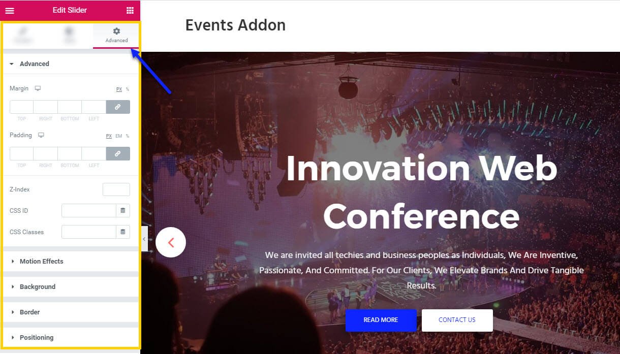
Step O4 :
In this step you’ll see what are the options available in Slider widget Advanced Tab.
The Advanced Tab consists of options for adding the advanced options for the shortcode.
- Advanced : It consist options like Margin, Padding, Z-index, CSS ID, CSS Classes for that whole section.
- Motion Effects : it having the animation options for about me section.
- Background : This option having Background Type and Hover Background Type option with Hover Transition Duration in it.
- Border : In this option you’ve options for Border, Box Shadow, Hover Border , Hover Box Shadow with Transition Duration
- Positioning : Her you control the Width of the section and change the Position of the section
- Responsive : In this option you can hide that section in Desktop, Tablet, Mobile based on your need.
- Attributes : It will help you to add custom Html Attributes but it will available once you installed the Elementor Pro version.
- Custom CSS : You can add your Custom CSS in this field. It will available once you installed the Elementor Pro version.
You can see types of styles in Slider widget Here